Background
Recently, I post math on Mathematics Stack Exchange instead of here.
Problem
How can one get a table for the distribution of reputation on that site?
Solution
Write a SQL query on Stack Exchange Data Explorer.
1 2 3 4 5 6 7 8 9 10 11 12 13 14 15 16 17 18 19 20 21 22 23 24 25 | |
The indentation is automatically done by Vim. I know that the
syntax is ugly. If I assign text string to the column u.range,
then the table is sorted in alphabetical order of that column
instead of numerical order. This doesn’t make sense. Therefore, I
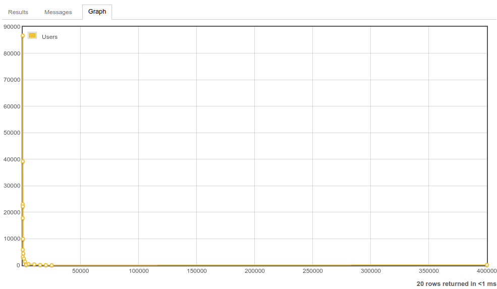
use a dirty way to get the statistics, and played with the built-in
graphing function. However, the visual result isn’t so
satisfactory.

Anyone who has completed high school will realise that a log graph is better. Asking for this feature on Meta Stack Exchange takes time. I believe that such feature request will be rejected by the moderator to reduce the workload of Stack Exchange company. Therefore, I plot the log graph using GNU Octave.
- Download the CSV file to get the data.
- Change it to an GNU Octave script file.
- Open it using Vim.
- Do the necessary text substitutions so that the data becomes a matrix.
- Complete the script file by adding the plot commands.
1 2 3 4 5 6 7 8 9 10 11 12 13 14 15 16 17 18 19 20 21 22 23 24 25 26 27 28 | |
I choose loglog because semilogx causes the labels on tail to
overlap. Here’s the results.

Lessons learnt
I can save plots in GNU Octave as a SVG file. I know this after
searching “octave export svg”. From
Printing and Saving Plots, I see print -d[device],
in which one can substitute the output format. For example, I used
print -dsvg to generate the SVG’s shown above.